
The HydroConquest has always been one of those watches that sat slightly awkwardly within Longines’ catalogue. Not quite a heritage piece, not quite a design-forward experiment, and for the longest time, not quite modern either. When it first arrived in 2007, it made sense as a robust, accessible entry into Swiss dive watches. But as Longines sharpened everything around it, the Spirit line, the Ultra-Chron, even the quietly confident GMT, the HydroConquest began to feel like it was stuck in a different era. Reviews have been polite about this, but the reality is that the old model’s oversized numerals and slightly overworked dial belonged to a very specific late-2000s design language that hasn’t aged particularly well. This new generation doesn’t reinvent the HydroConquest so much as correct it.
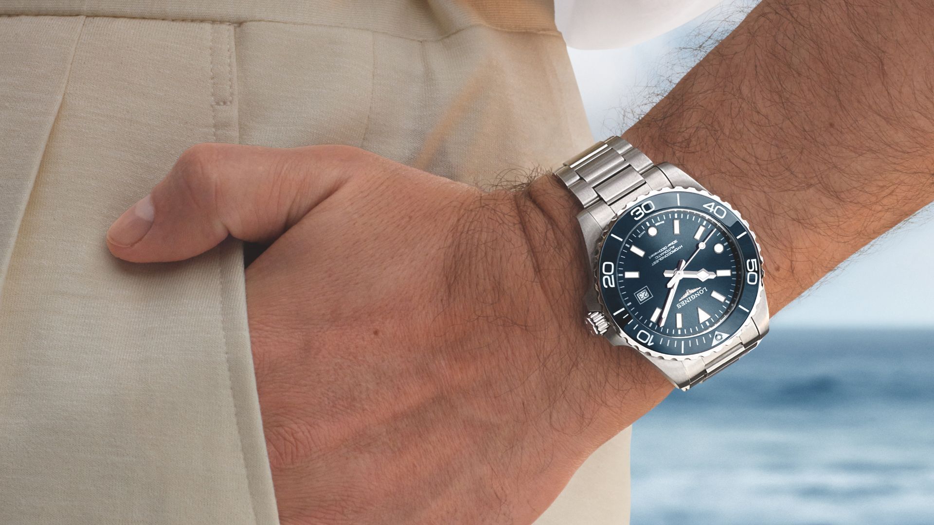
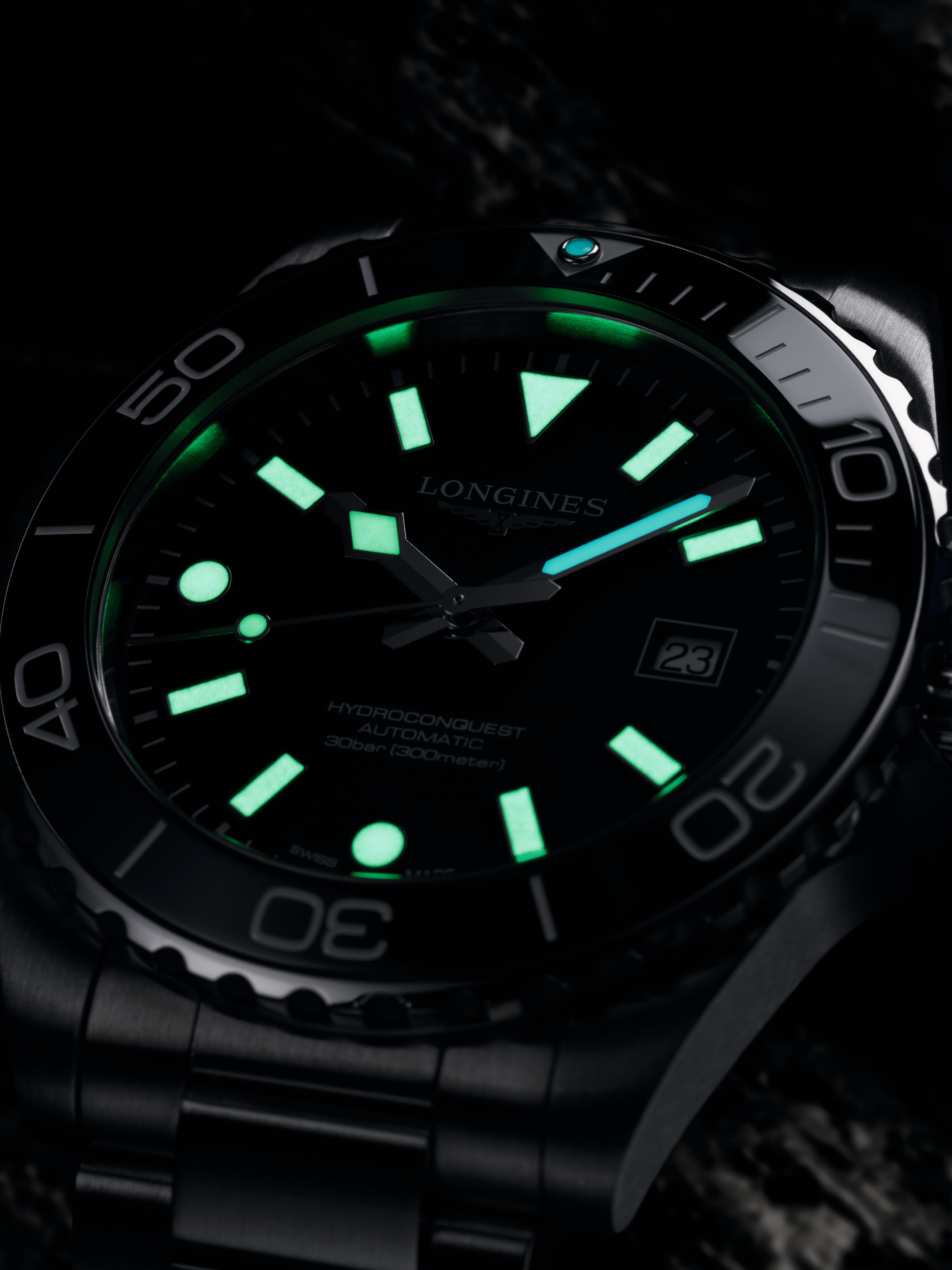
That correction starts with the dial, and it’s the most obvious shift. The numerals are gone, replaced with a cleaner, more conventional layout of applied indices that borrow heavily from the GMT introduced in 2023 . It’s a move that trades personality for clarity. Depending on how attached you were to the old watch, that will either feel like a loss or a relief. I’ve always leaned into the latter. The old dial felt busy in a way that didn’t quite justify itself. This one is calmer, sharper, and far more wearable across contexts. You still get a hint of Longines identity through the mix of rectangular and circular markers, but it now sits within a much more familiar dive watch framework.
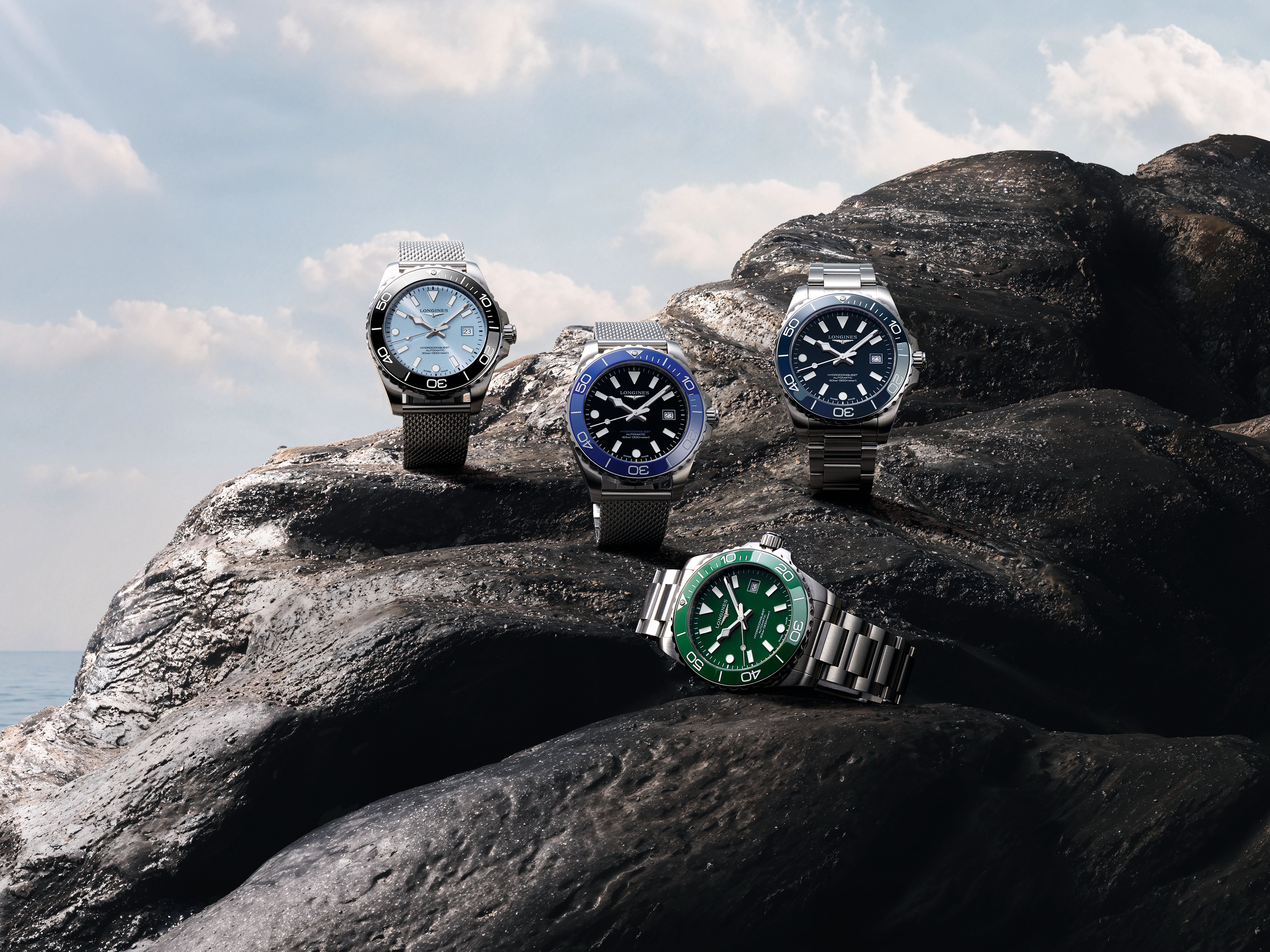
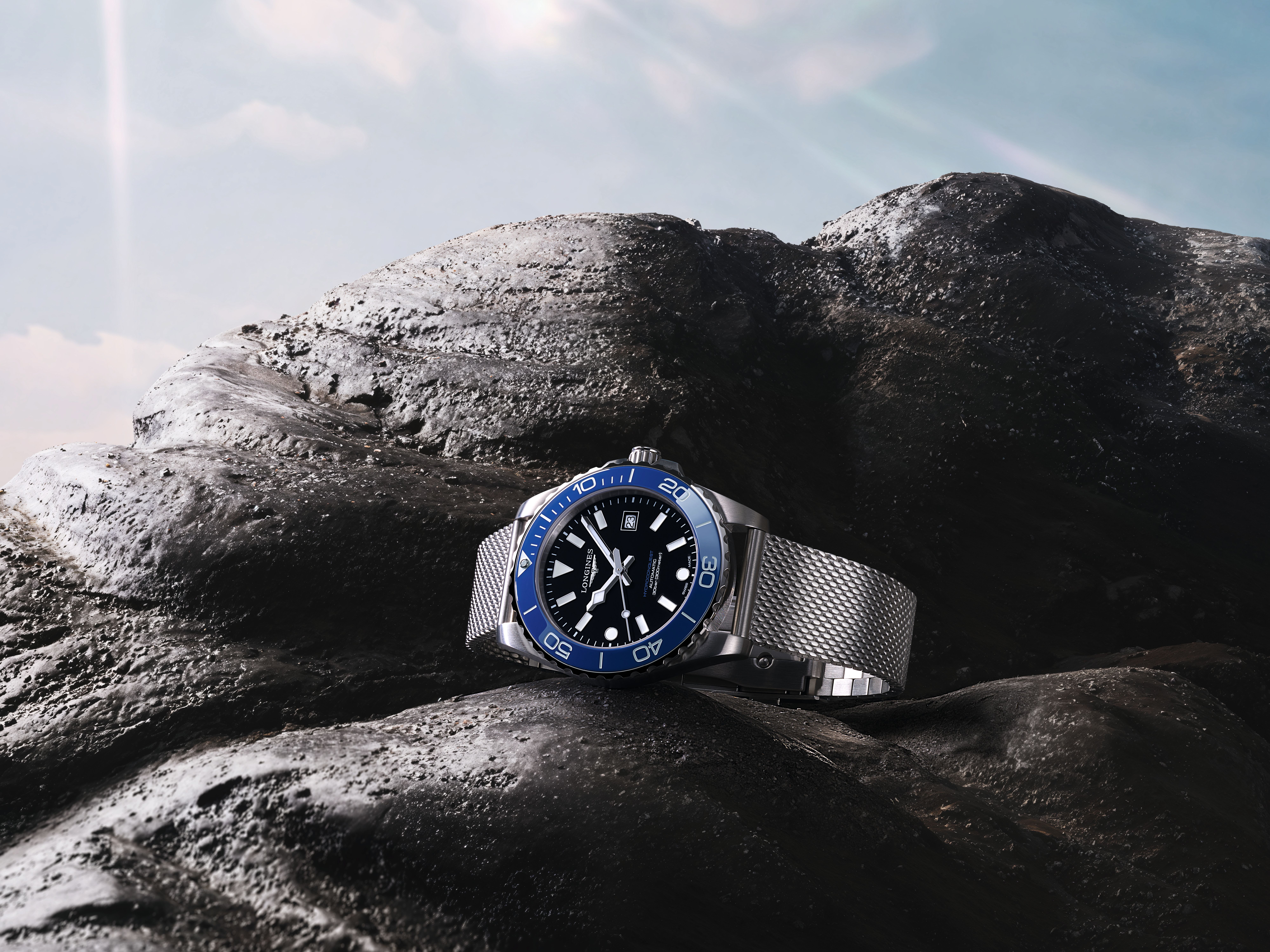
Seeing the full spread of colours in person only reinforces how much this watch is trying to broaden its appeal. The black lacquer dial with the so-called “Luminous Blue” bezel is the obvious crowd-pleaser, and it works. There’s a vividness to that ceramic insert that gives the watch real presence without tipping into gimmick. But the one that stuck with me was the boutique-exclusive frosted blue dial paired with a black bezel (pictured below). It feels more restrained, almost quietly confident, and it’s a shame it’s unlikely to be available in India. Across the range, the shift from sunburst to lacquer dials is noticeable. It adds gloss and depth, and gives the watch a more contemporary feel, even if it nudges things slightly towards desk-diver territory.
On the wrist, sizing is where things get interesting. I’m firmly in the sub-40mm camp, and the 39mm is easily the more balanced of the two. It sits neatly and feels proportionate. But the bracelet changes the equation. The mesh, in particular, is so wearable that the 42mm suddenly becomes far more viable than it should be. It still reads larger, but it doesn’t feel unwieldy. Both sizes share the same relatively slim 11.7mm thickness and 300m water resistance, which helps keep things grounded. The overall impression is slightly top-heavy but planted. There’s weight, but it feels controlled rather than clumsy.
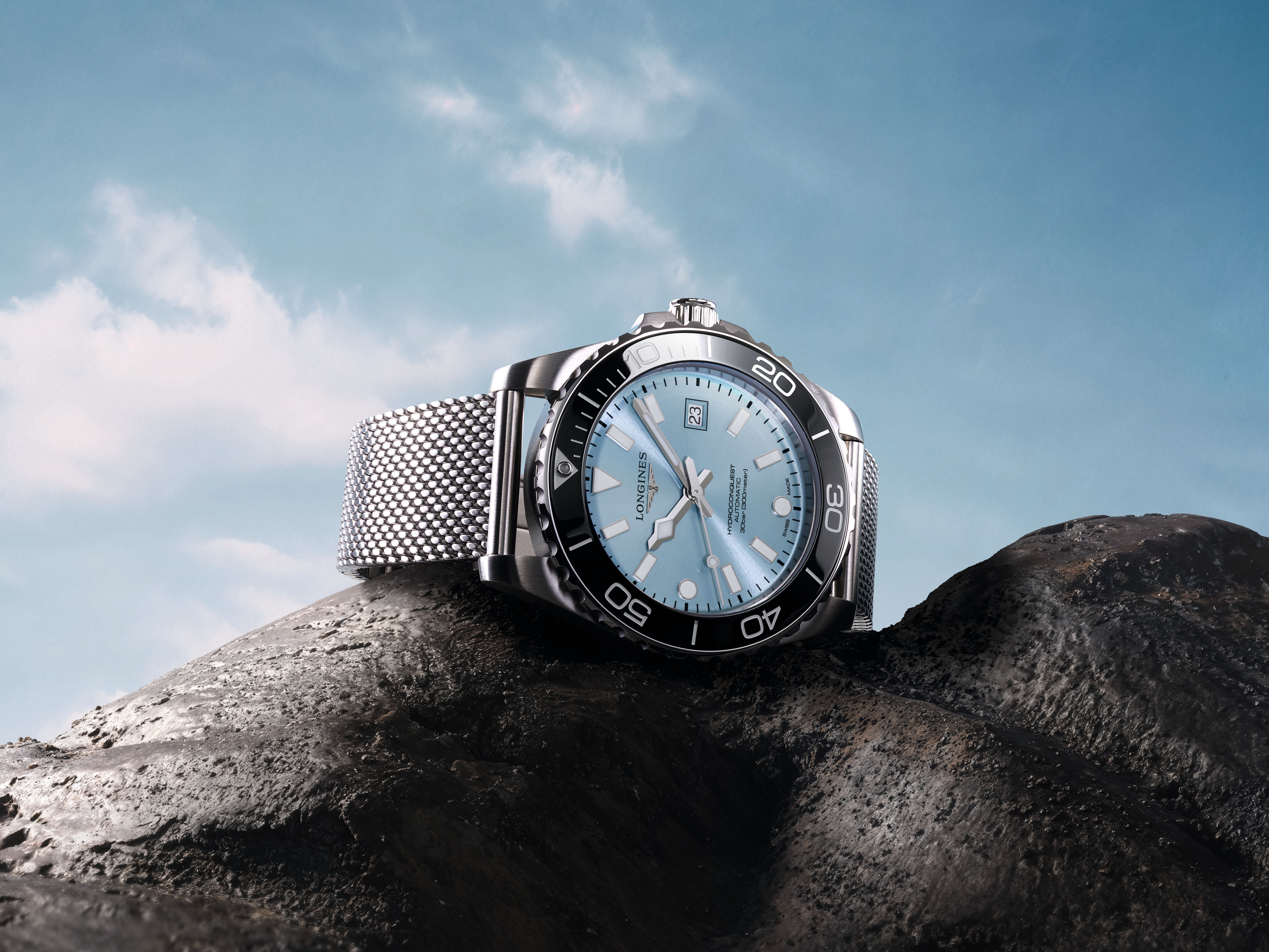
The bezel is another area where Longines has made quiet improvements. Hodinkee points to an updated internal click system derived from the Ultra-Chron Diver, aimed at improving tactility. I won’t pretend to be obsessive enough about dive bezels to break that down technically, but in use, it feels exactly as it should. It’s easy, tactile, and reassuringly solid. The chunkier knurling adds to the tool-watch feel, while the ceramic insert, with its engraved numerals and glossy finish, pulls things slightly back towards refinement.
Then there’s the bracelet, which is arguably the real story here. Milanese mesh isn’t new, and Omega has spent the last few years repositioning it as a dive watch premium package rather than an afterthought. Longines has clearly taken notes from its sister Swatch Group brand. Their execution is genuinely impressive, not just in finishing but in construction. The sectioned portion near the clasp, where traditional mesh transitions into link-like segments, is a clever solution that improves both sizing and comfort. It feels natural and purposeful. More importantly, it avoids the bulky, awkward clasps that have plagued similar designs. Reviews describe it as a more comfortable and premium take on a style that often feels flimsy , and that lines up with my experience. It’s beefy enough to support the watch’s tool credentials, but still retains the elegance that makes mesh appealing.
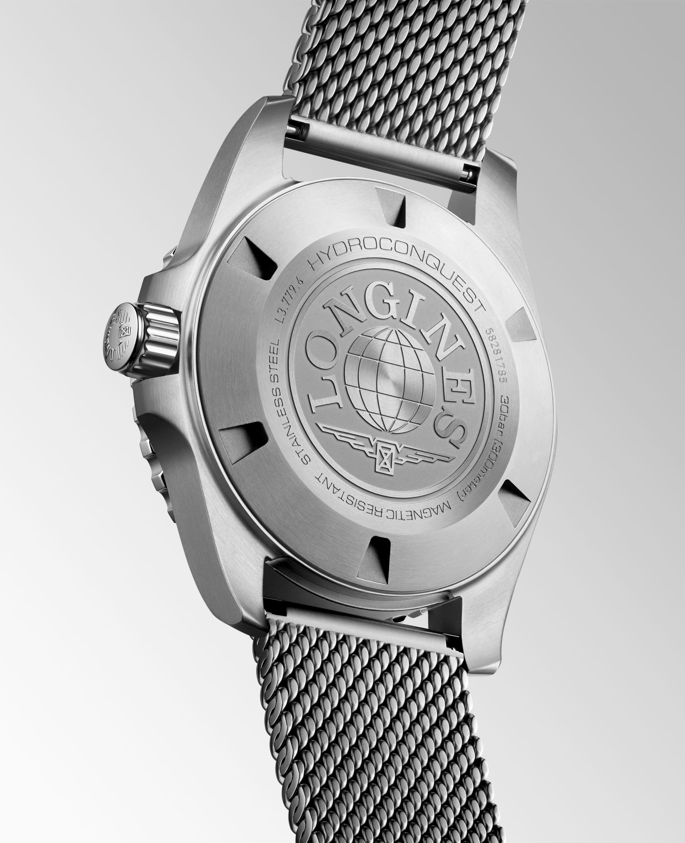
The standard H-link bracelet is still available for those who prefer a more traditional look, but it feels secondary this time around. The mesh gives the watch its identity. It also reflects a broader shift in how dive watches are perceived. They’re no longer just instruments. They’re everyday objects that need to move between contexts without friction. In that sense, the HydroConquest is less about diving and more about versatility.
Under the hood, Longines sticks with what works. The L888.5 automatic movement offers a 72-hour power reserve, a silicon balance spring, and improved resistance to magnetism. It’s not chronometer-certified, and the 25,200 vph beat rate remains slightly unusual, but in practical terms it’s dependable and easy to service. At this level, the real differentiator isn’t the movement. It’s everything around it, and that’s exactly where Longines is focusing its efforts.
If there’s a broader takeaway here, it’s that the new HydroConquest is deliberately inoffensive. And that’s not a bad thing. It’s cleaner, more versatile, and more commercially viable than what came before. It does come at the cost of some of the old model’s oddball charm. You can see why some might call it generic, or accuse it of leaning too heavily into familiar dive watch tropes. There’s a (strong) hint of Submariner, a touch of Seamaster, and just enough Longines left to keep it from feeling like a straight homage.
But it will sell. More importantly, it will make sense to a wider audience than the previous generation ever did. Longines isn’t trying to create a cult object here. It’s trying to build a watch that competes, cleanly and confidently, without unnecessary quirks. In that context, this feels like a smart reset. The HydroConquest has finally caught up with the rest of the brand.


