For most of its life, the Planet Ocean has occupied a curious space in Omega’s line-up. Born in 2005, it wasn’t the Bond-tied Diver 300M, nor the elegant Aqua Terra, nor the vintage-leaning Seamaster 300. Instead, it was the modern diver: a thicker, tougher, more muscular take on the brand’s ocean DNA. The early models still nodded to 60s Seamaster codes, but each subsequent generation drifted into glossier, heavier territory—more ceramic, more Liquidmetal, more height. Over time, the PO lost some of the crisp, toolish restraint that made the originals irresistible.
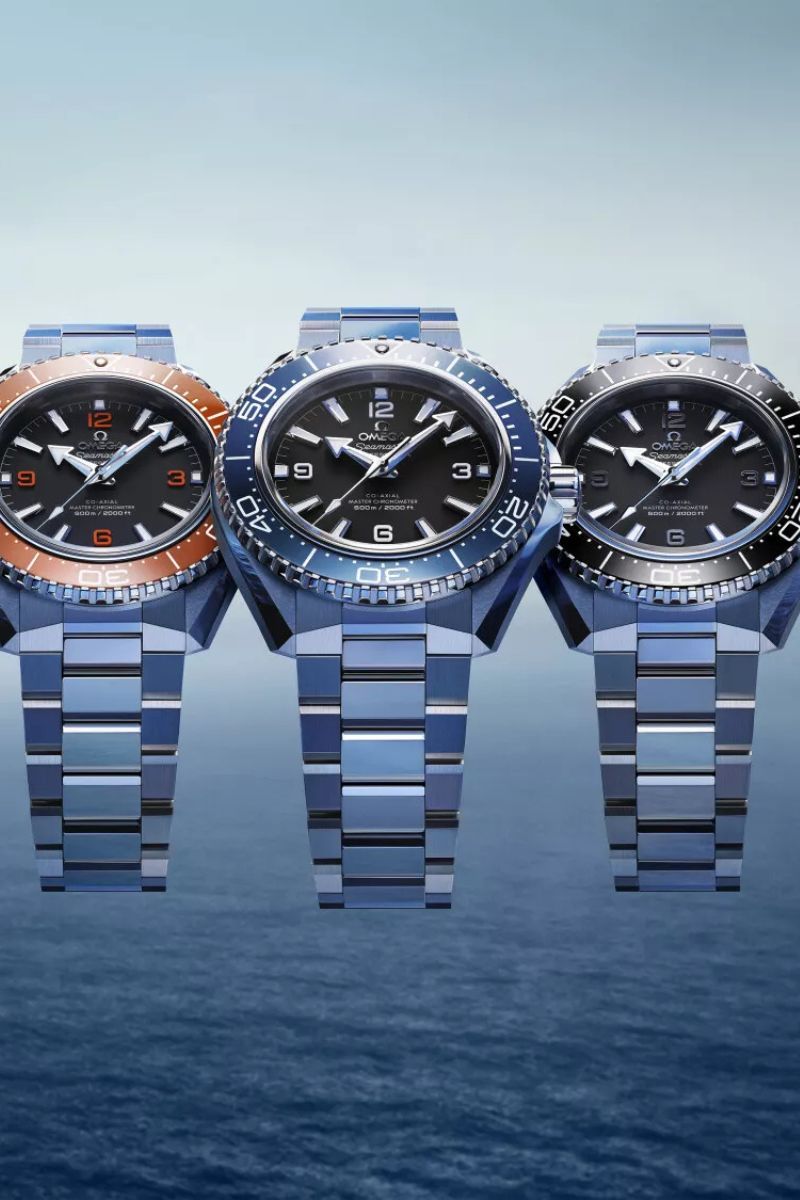
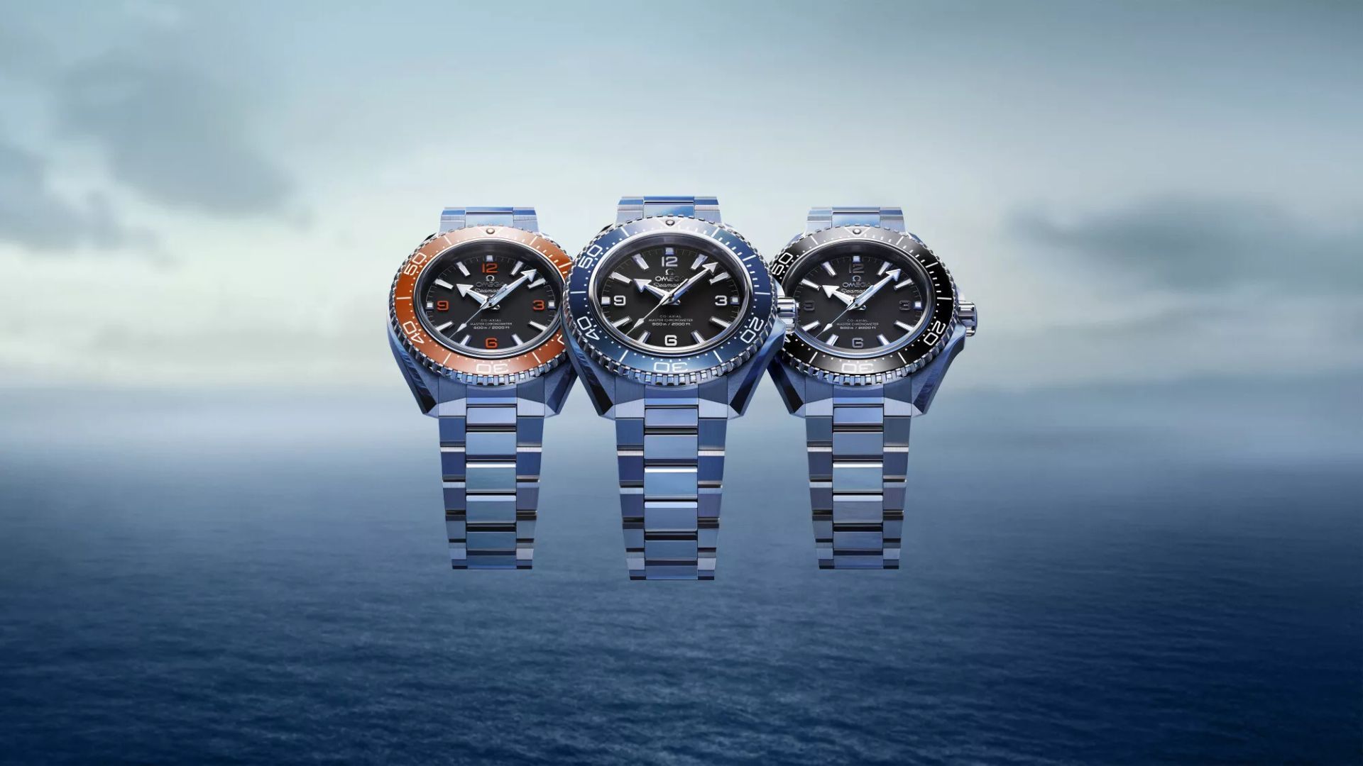
This year marks the collection’s 20th anniversary, and Omega has chosen to do more than update the details. The fourth-generation Planet Ocean is a full-scale redesign — new case, new proportions, new numerals, new bracelet, new colours, new everything. The intent is clear: Omega wants the Planet Ocean to feel modern again, not just modernised.
A Fitter, Sharper, More Contemporary Planet Ocean
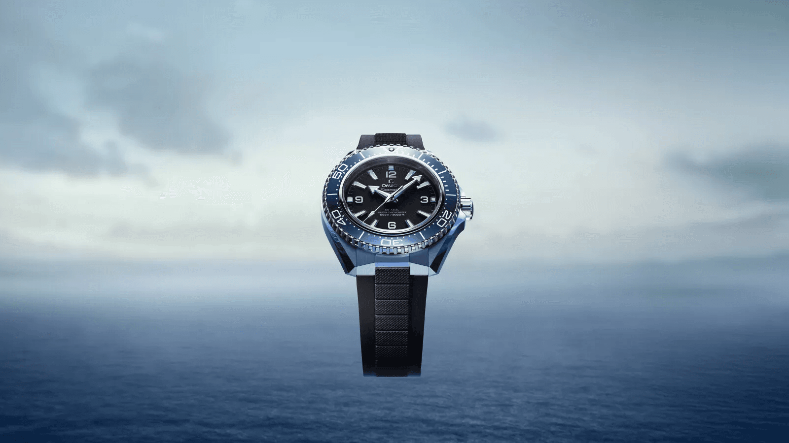
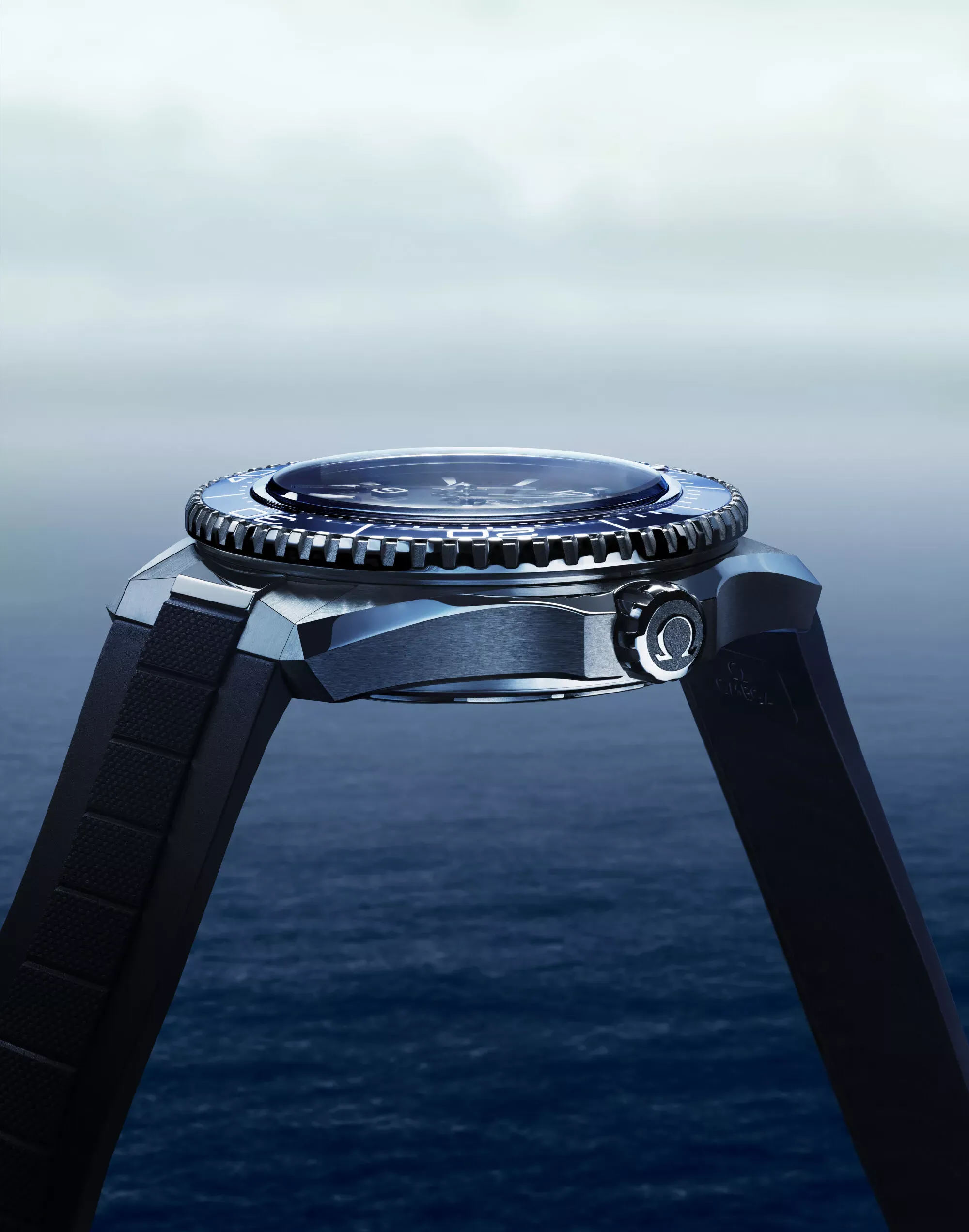
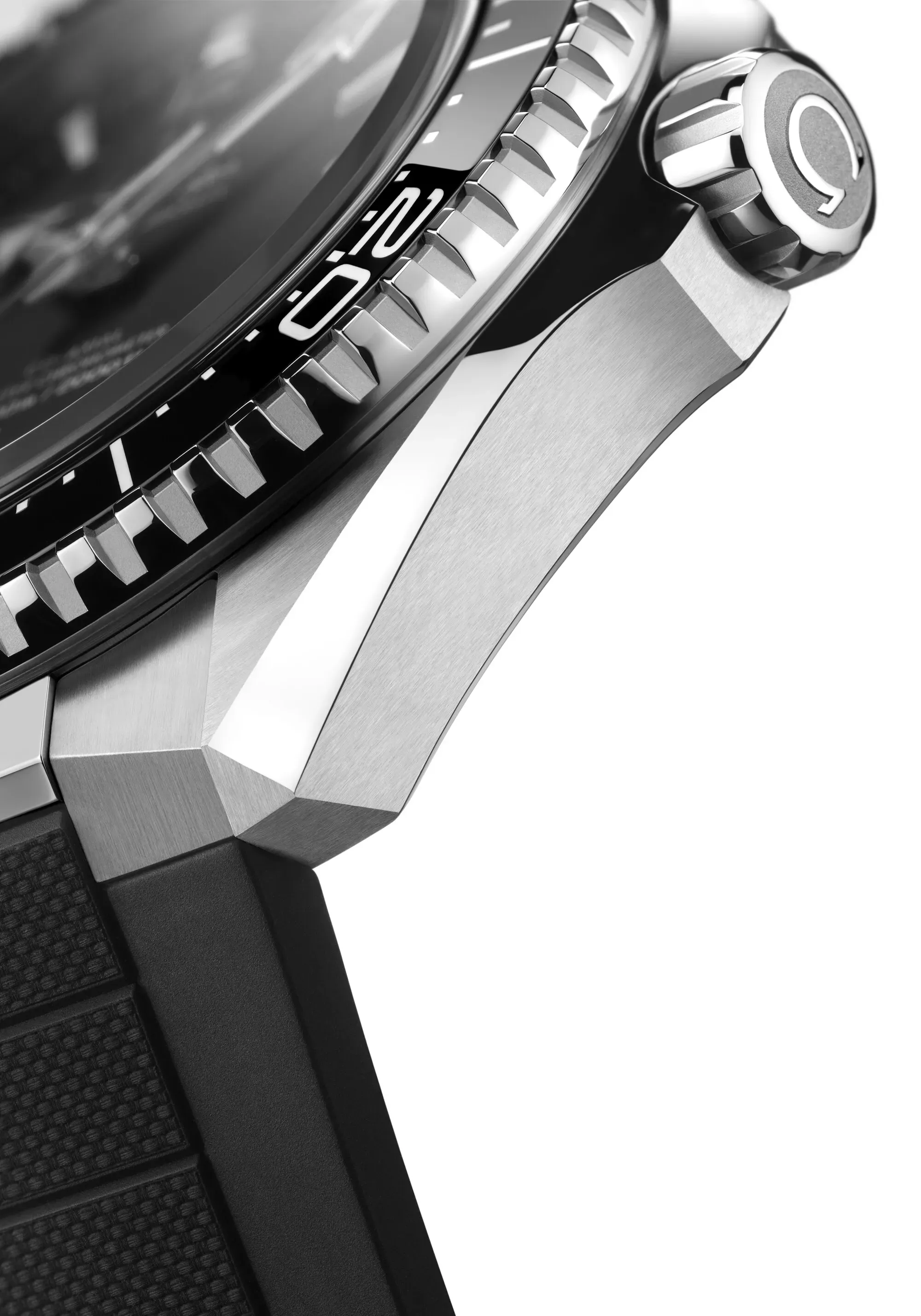
The biggest step forward is basic wearability. At 13.79 mm, the new cases are far slimmer than the famously chunky 16.1 mm previous generation; a change enabled by a switch to a flat crystal and a titanium inner case ring. The lug-to-lug shrinks slightly, and the case now drops away much more steeply, giving the watch a sleeker profile and a faintly integrated-bracelet feel. It’s a better-balanced watch, full stop. I like the titanium caseback decision too, since it’s a practical move that trims weight without compromising the PO’s hefty 600-metre rating.
The dial architecture stays recognisably Planet Ocean—matte black base, big Arabic numerals, broad hands—but everything has been re-drawn. The numerals are now open-worked and bolder, the colourways are focused (black, blue, and the signature orange), and the bezels return to high-impact ceramic. Orange ceramic, in particular, remains a technical headache to produce, which Omega openly acknowledges through its higher pricing.
The bracelet is the most divisive element online, but I’m unapologetically on the side of “why not?”. It’s slimmer, flatter, more faceted, and yes, more polished. But let’s be honest: a modern Planet Ocean with actual dive time is an anthropological rarity. Most will live on land, in cities, under shirts, at desks. A bit of polished presence feels honest to what the PO has become; a sport-luxury diver with strong personality rather than a hardcore instrument. For purists, the rubber straps remain an option, and the new steel end-links give them the same visual cohesion as the bracelet.
The helium escape valve—a two-decade design signature—is gone entirely. I’m still on the fence about this one. Its practical utility in the 21st century is basically nil, but symbolically, it was a bit of Planet Ocean lore. On the wrist, though, the cleaner silhouette does look better… and is likely to ignite some debate amongst purists. Inside, the METAS-certified calibre 8912 keeps things familiar: twin barrels, Si14 silicon balance spring, 60-hour reserve. It’s proven, robust, and entirely appropriate for a relaunch focused more on wearability and design language than movement experimentation.
What The New PO Signals
What I find most interesting is not the spec uplift, but the shift in form. The new Planet Ocean leans into stronger lines, harder facets, and a more architectural silhouette. It’s a noticeable pivot from the soft, rounded cases of previous generations, and it mirrors what many agile microbrands have been doing in the dive-watch space over the last two years.
Smaller independents have been experimenting heavily with angular designs: blocky mid-cases, pronounced bevels, polished-and-brushed geometry, and integrated-style end-links. It’s a trend driven by the need to stand apart from endless vintage homages. Omega’s redesign feels like a response to that visual energy — a recognition that modern divers don’t all need to look retro or cushion-shaped to feel authentic.
But here’s the strategic bit: this redesign positions the Planet Ocean as Omega’s forward-facing diver, not its heritage diver. The Diver 300M (and to an extent, the Seamaster 300) will hold the nostalgic ground. The PO is now the testing ground for the brand’s modern sport-luxury identity. The HEV deletion strengthens that theory. So does the slimmer build. So does the faceted bracelet. Even the bolder numerals hint at a clearer design divergence within the Seamaster family.
But the bigger takeaway is this: Omega is willing to take risks with the Planet Ocean again. Not incremental nibbling, but real design leaps. And that’s good for the brand and frankly, good for the dive-watch landscape, which has spent the last decade circling the same vintage-themed block. I think the new Planet Ocean is cool. Flawed in parts, yes, but ambitious, confident, and much more wearable than before. It acknowledges what modern buyers actually do with their watches, not what they used to. And it shows that Omega is looking outward—not just backwards—when shaping its next era of dive design.


