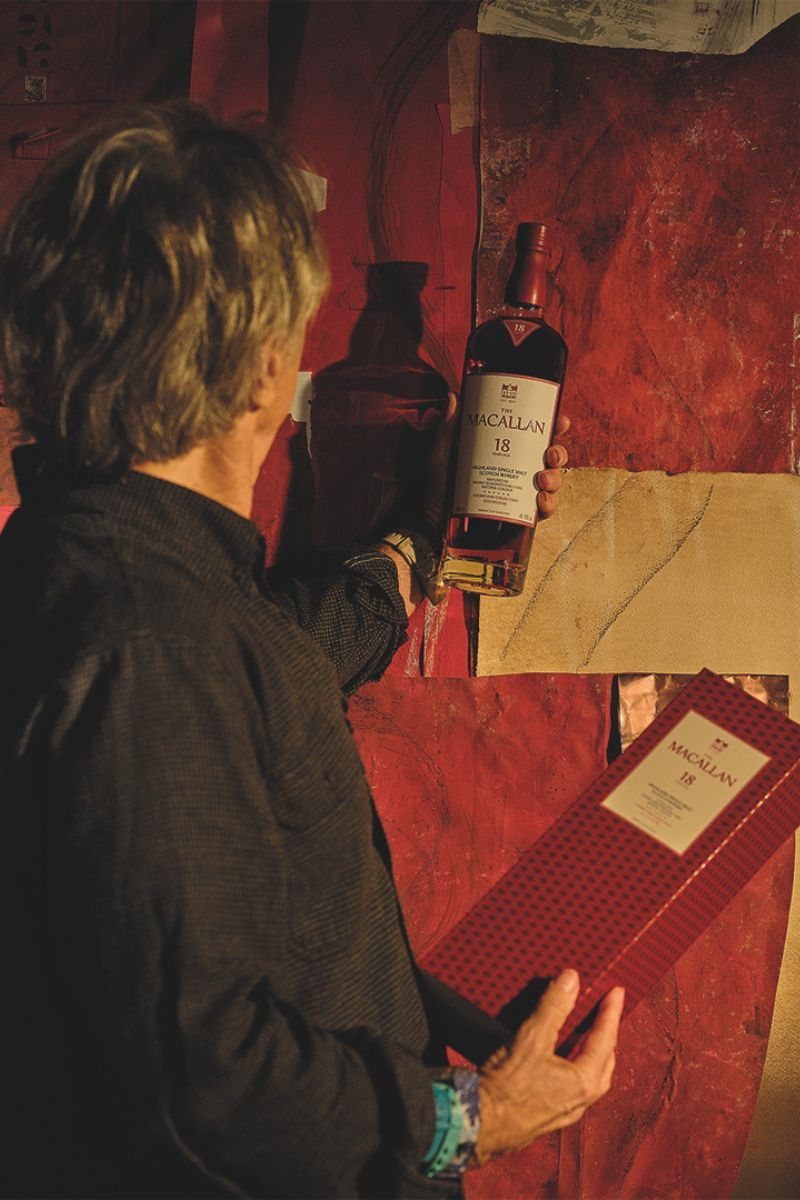
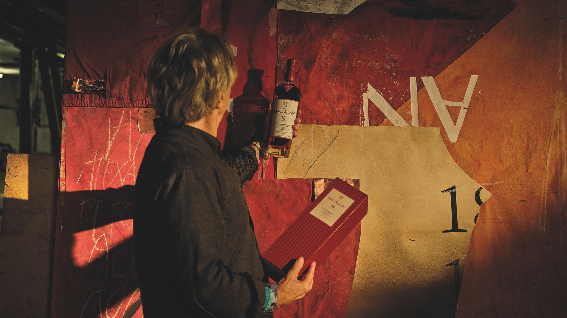
There is a particular kind of confidence involved in picking up a bottle of whisky, turning it over once or twice, and acting as though everything printed on it makes perfect sense. The age statement is easy enough. The producer’s name is usually impossible to miss. After that, however, the language becomes more specialised: American oak, European oak, sherry seasoning, natural colour, cask influence, tasting notes that promise everything from citrus peel to polished wood. For a category that trades heavily on ritual, history and acquired knowledge, whisky has not always been especially good at helping the person standing in front of the shelf.
That is changing. A modern whisky bottle is no longer expected to function only as a handsome container or a recognisable shape on a crowded back bar. It must still carry status, certainly, but it is increasingly being asked to explain itself. The best examples offer a visual shorthand for how the whisky was made, what it may taste like, where its character comes from and how it differs from the bottle sitting beside it. In a market where buyers are more design-aware, better informed and increasingly wary of empty luxury signalling, packaging has become part flavour map, part identity card and part invitation.
Whisky bottles only became truly useful brand objects once glass production became consistent enough to make recognisable shapes at scale. Before mechanised bottle-making transformed the industry in the early 20th century, glass containers were expensive, variable and largely functional. Mass production allowed distillers to develop silhouettes, labels and visual codes that could travel further than the distillery itself. Over time, the bottle became a miniature piece of architecture: part protective vessel, part advertisement, part promise. The challenge in 2026 is that this architecture must now do more than look expensive. It has to reward a closer look.
“Before someone pours a dram, the bottle should already begin to tell the story of what is inside,” says Jaume Ferras, Creative Director at The Macallan. “Not only the age or expression, but the craft, provenance and character behind it.” That idea sits behind the reimagined identity of The Macallan’s Timeless Collections, encompassing Double Cask, Sherry Oak and Colour Collection. The whisky itself has not changed. What has changed is the way the bottle and its packaging organise information, using colour, cask symbols, tasting notes and references to place to make the range easier to understand.
Beyond The Age Statement
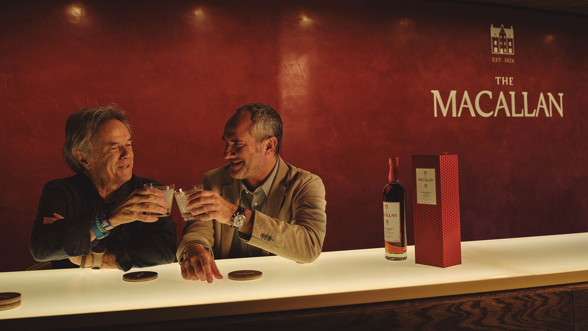
The number on the front remains the most familiar way into whisky, although it is often asked to carry more meaning than it reasonably can. On a bottle of Scotch, the age statement refers to the youngest whisky in the bottle. A 12-year-old expression may contain older spirit, but none younger than 12. It is useful information, but it is not a league table. Older whisky is not automatically better, richer or more sophisticated. Time matters, but so do the original spirit, the warehouse conditions, the cask and the decisions taken during maturation and blending.
For the buyer, the wood is often the more revealing detail. Whisky does not simply wait inside a barrel until it becomes respectable. It draws colour, aroma and flavour from the oak, while slowly changing through oxidation and interaction with the cask. American oak is commonly associated with notes of vanilla, coconut, citrus and lighter sweetness; European oak tends to bring deeper spice, dried fruit and a firmer tannic structure. These are tendencies rather than rules, but they offer a more useful starting point than assuming the largest age statement must contain the most interesting liquid.
The Macallan’s redesigned packaging turns this distinction into a visible system. Within Double Cask, red is used to signify the influence of European oak, while white represents American oak. Because the range combines both types of sherry-seasoned cask, the visual balance of red and white mirrors the liquid’s own construction. The Sherry Oak Collection, shaped by sherry-seasoned European oak, is presented in fully red boxes, immediately separating its richer, more spice-led character from the softer visual language of Double Cask. The Colour Collection, meanwhile, uses sherry-seasoned American oak and is defined by a spectrum of natural golden hues.
“Colour is one of the most powerful ways we can express character before a word is read,” Ferras explains. “Red tones speak to European oak influence and the richness of sherry seasoning, while lighter cues help signal the contribution of American oak.” This is where the system becomes more than a redesign exercise. Instead of expecting buyers to remember a technical specification, the packaging converts oak type into an instinctive visual cue. “It is not simply decoration,” he adds. “It is a way to make flavour, aroma and cask influence more immediate and more memorable.”
The whisky’s own colour also has something to say, although it is worth approaching with a little scepticism. A deeper shade does not automatically mean greater age or quality. Cask species, previous cask use and maturation conditions can all change the colour dramatically. What matters more is whether that colour is natural. In The Macallan’s case, the tones visible through the bottle come from the interaction between spirit and oak rather than cosmetic adjustment. The liquid therefore becomes part of the packaging’s information system: a visible result of wood, sherry seasoning and time.
This is where the redesigned collections become particularly useful for someone who may not yet speak fluent whisky. Ferras describes the ambition as creating a visual language that allows consumers to understand the ranges naturally, without making the experience feel overly technical. The distinction matters. Luxury packaging can quickly become condescending when it tries too hard to educate, but it can be equally frustrating when it hides behind vague language and expects the buyer to already know the answers. “Complexity should never become a barrier,” he says. “The role of design is to open the door and create a sense of invitation.”
David Carson On Making Whisky Easier To Read
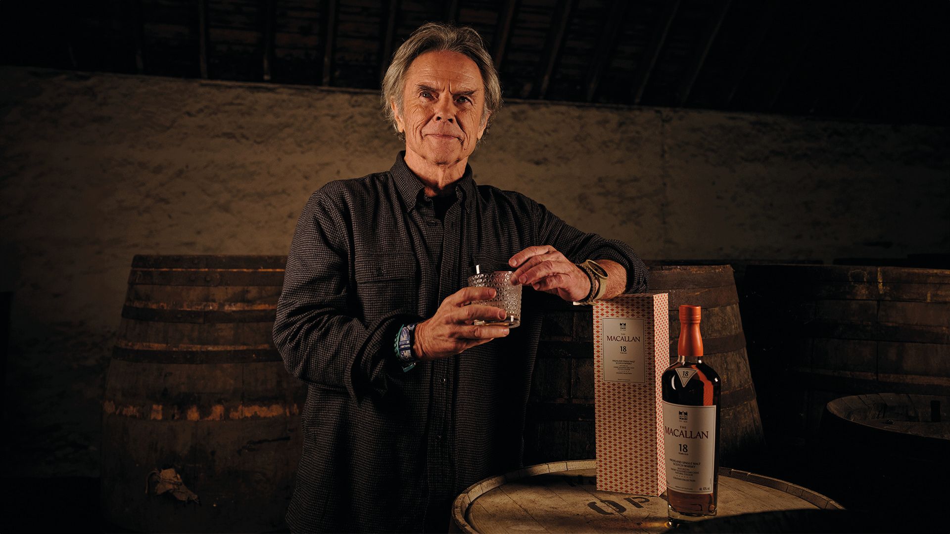
David Carson is one of the most influential graphic designers of the past four decades, best known for the radical typography and fractured layouts he brought to magazines such as Ray Gun and Beach Culture in the 1990s. His work challenged neat grids, conventional hierarchy and the idea that legibility was the same thing as communication. That made him an intriguing choice for a redesign intended to make a whisky portfolio easier to navigate.
“In many ways, yes,” Carson says when asked whether The Macallan presented the reverse of his earlier editorial work. “The work was not simply about making the bottle easier to read, but about creating a visual language that could communicate the depth and character of The Macallan with greater instinct and resonance.” The distinction is important. “I have always believed that clarity and communication are not the same thing,” he adds. “Something can be perfectly legible and still fail to say anything meaningful.” The task was not to flatten the Timeless Collections into a purely functional system, but to guide drinkers through Double Cask, Sherry Oak and Colour Collection while preserving some ambiguity, atmosphere and discovery.
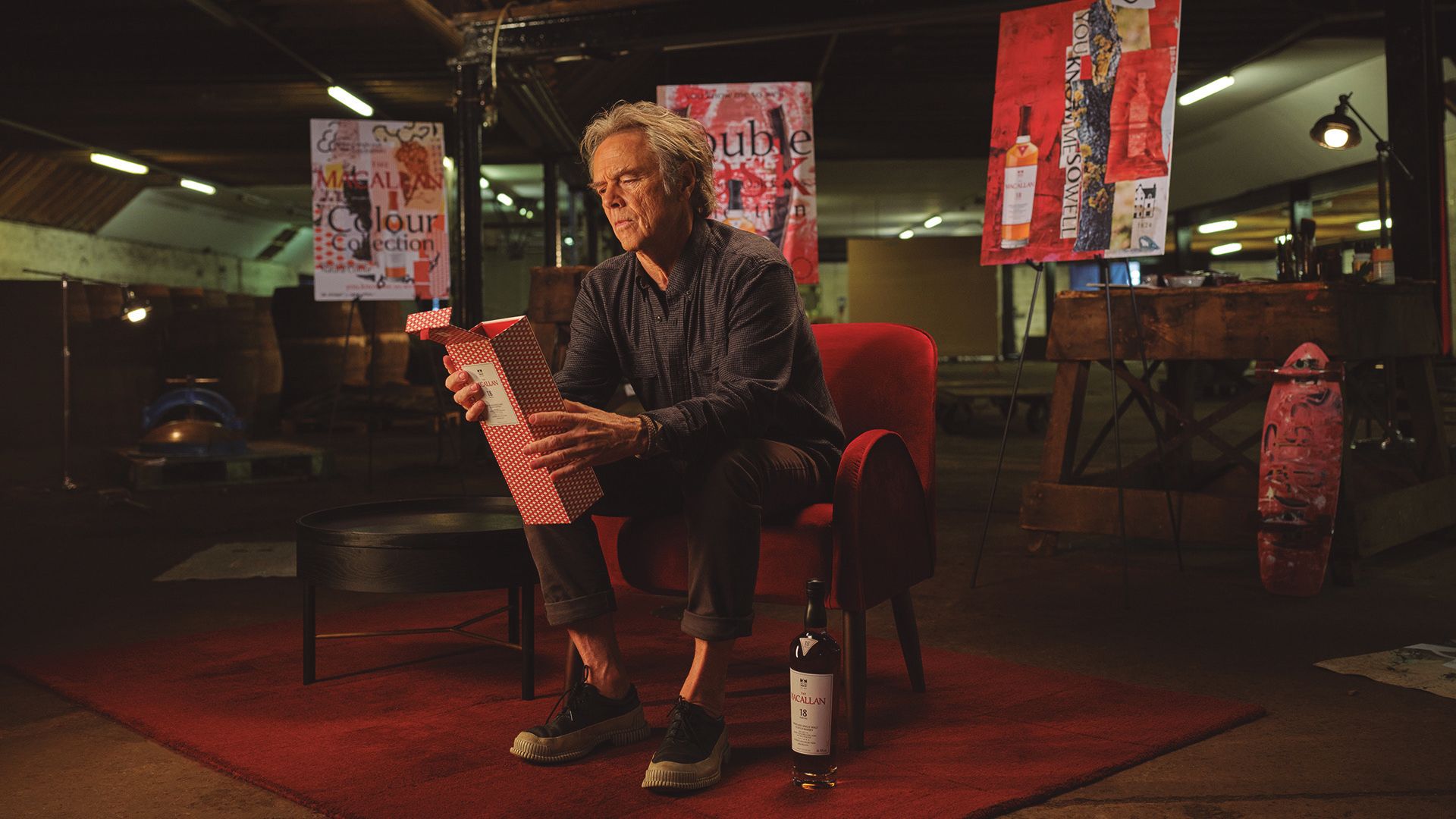
Carson approached the redesign as a complete world rather than a collection of isolated labels. Typography, imagery, bottle form and packaging all needed to carry the same ideas: sherry, wood, time, craft and place. He also moved away from a purely digital process, returning to paper, paint and natural materials during development. “There is a presence and tactility in those materials that digital design can sometimes lose,” he says.
The result is cleaner without becoming clinical. The colour coding, cask symbols and tasting information offer direction, while the bottle’s silhouette and shoulder label reward the more curious eye. In Carson’s words, the aim was to guide people through the collections “while still preserving the sense of discovery, emotion and quiet complexity that sits at the heart of the whisky”.
For Carson, the ideal encounter with the finished bottle is similarly unhurried. He describes The Macallan as a whisky that “rewards time and attention”, best shared among people who appreciate craft, detail and the stories behind what they are drinking. It is a fitting note on which to end. The redesigned bottle may be easier to read, but it is not designed to be exhausted at a glance.
When Luxury Packaging Becomes Useful
For years, the front label carried the prestige while the back label handled the chores. It was where brands deposited regulatory copy, broad tasting language and a paragraph about heritage in a type size designed to discourage reading. The back label on the Timeless Collections has been given a more purposeful role. Tasting notes, cask-type symbols and additional product information are arranged to help buyers navigate between expressions rather than simply admire them.
This matters because tasting notes are most valuable comparatively. No label can guarantee that every drinker will find exactly the same orange peel, ginger, vanilla or dried fruit. Taste is too subjective for that, shaped as much by memory and experience as chemistry. But tasting notes can offer direction. A buyer drawn to fresh fruit, toffee and softer spice may find Double Cask the more natural entry point. Someone looking for dried fruits, ginger and deeper wood spice may lean towards Sherry Oak. The Colour Collection, with citrus, vanilla and increasingly tropical fruit character across its age statements, points in another direction again.
The revised back label therefore does something luxury packaging has not always been particularly interested in doing: it helps. “I don’t see usefulness and aspiration as opposites,” says Ferras. “A bottle of The Macallan must feel aspirational, but it should also help the consumer understand why it is exceptional.” His description of good luxury packaging is refreshingly simple: “It should be beautiful at first sight, and more meaningful the more you spend time with it.”
That closer look also reveals how geography has been worked into the physical bottle. Its increased height, broader shoulders and narrower base take inspiration from the sweeping roofline of The Macallan Distillery in Speyside. The triangular shoulder label refers to the Sherry Triangle around Jerez de la Frontera, the Andalusian region where the brand’s oak casks are seasoned with sherry wine. In one object, the design connects the two landscapes most important to the whisky: Scotland, where the spirit is made and matured, and southern Spain, where the cask story begins.
“It was essential,” Ferras says of embedding provenance into the design. “The strongest ideas are the ones that feel inevitable, the ones that honour the past while pointing confidently to the future.” That word, inevitable, is useful. The bottle does not require the buyer to recognise every reference immediately. Its job is not to turn packaging into a trivia test. Rather, the roofline, shoulder label, colour coding and back-label information accumulate into a system that becomes more rewarding as the consumer learns to read it.
There are less romantic forms of information, too. Unique QR codes offer further details about individual expressions, while anti-counterfeit technology provides greater traceability. That may not carry the poetry of oak forests or sherry bodegas, but it matters in a category increasingly shaped by collecting, gifting and secondary-market value. A whisky bottle today must prove not only what it is, but that it is what it claims to be.
None of this, of course, replaces tasting. No amount of visual intelligence can guarantee that a particular whisky will suit your palate. What good packaging can do is narrow the distance between curiosity and confidence. Age tells you how long. The cask tells you where much of the flavour may be coming from. Natural colour offers a visible trace of maturation. Tasting notes help position one expression against another. Provenance explains why the bottle looks the way it does. And crucially for collectors, authenticity features offer reassurance once the price begins to climb.
The modern whisky bottle is therefore doing several jobs at once: flavour guide, geographical map, luxury object, verification device and, ideally, a rather good-looking piece of glass. The point is not to decode every last symbol before buying. It is simply to look beyond the biggest number on the label. Start with the oak, follow the colour, turn the bottle around, and let the design tell you where to look next.


